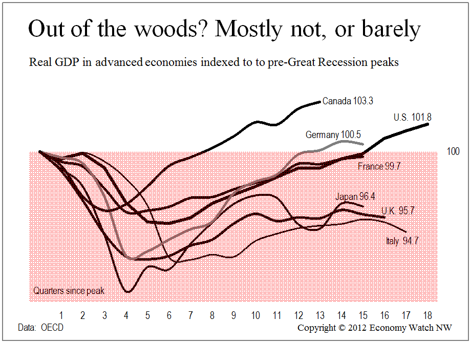
I’m working on charts that I will use in my upcoming speaking assignments. I try hard to make effective use of charts, especially in giving people a view from 10,000 feet, perspective aimed at overcoming the day-to-day noise about the economy.
Here’s one. The seven largest advanced economies account for about half of global gross domestic product. The chart shows that in real terms, after adjusting for inflation, only three of the seven have overtaken their pre-Great Recession highs. Four others, France, Japan, the U.K. and Italy, are still in the “red zone” on the chart. Their economies are smaller in real terms than they were four or five years ago.
The underlying data are from the Organization for Economic Co-operation and Development (OECD) via the excellent data tools at the web site of the Federal Reserve Bank of St. Louis.
The economies peaked at different times — Italy as early as Q3 2007, Canada as late as Q3 2008, when the U.S. was already nine months in to the Great Recession. Different entry dates, as well as lags in reporting, account for differing line lengths.
