 How anemic has been the recovery from the Great Recession?
Here’s one way of looking at it. Until the Great Recession (December 2007-June 2009), the lengthiest recessions of the post-World War II era were 1973-1975 and 1981-1982, both at 16 months. The Business Cycle Dating Committee of the National Bureau of Economic Research, the official arbiter of such matters, puts the Great Recession’s duration at 18 months, with the start date in December 2007 and the trough in June 2008.
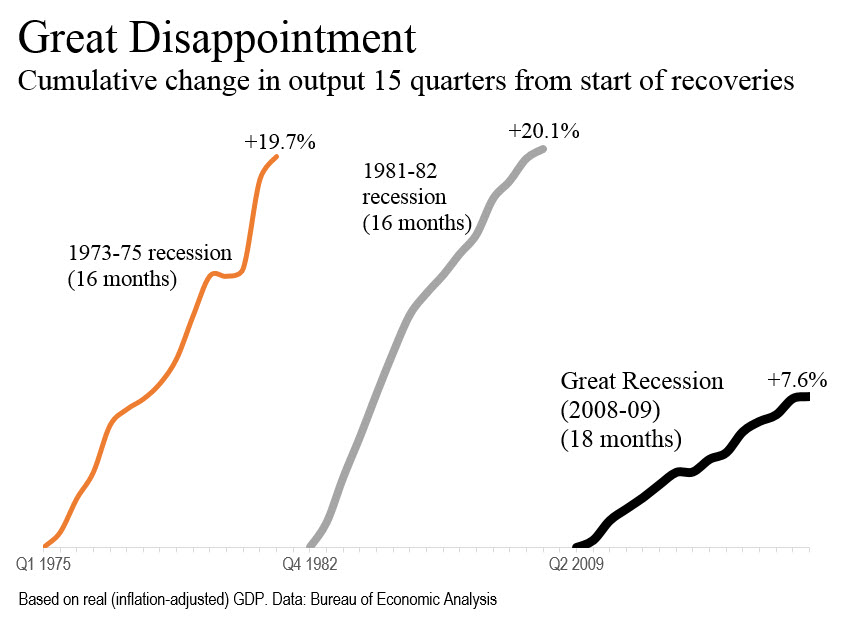
Here’s the punch line: The U.S. economy in the latest quarter for which we have data, the fourth quarter of 2012, was only 7.6% larger in real terms (after adjustment for inflation) than at the start of the recovery 15 long quarters ago. At this stage in the recovery from the 1973-1975 recession, the U.S. economy was 19.7% larger, from the 1981-1982 recession 20.1% larger.
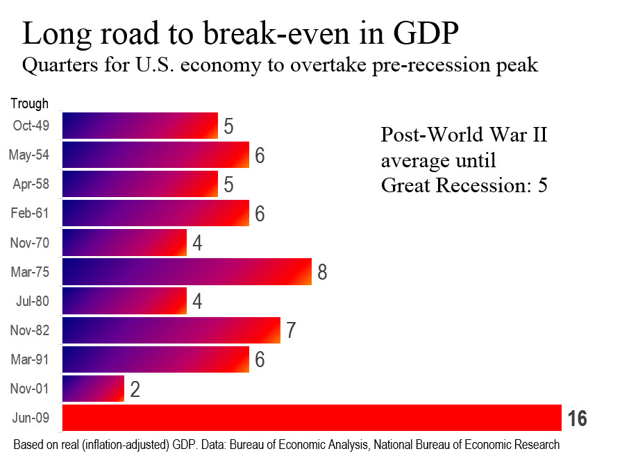
You can see this in the top chart. The other chart is another way of making the same point. It took sixteen quartes for the U.S. economy to overtake the level of output it had reached before the Great Recession.
This is by far the weakest recovery of the 11 in the post-World War II era. On average until the Great Recession, overtaking the previous high on a real (inflation-adjusted) basis has taken only five quarters.
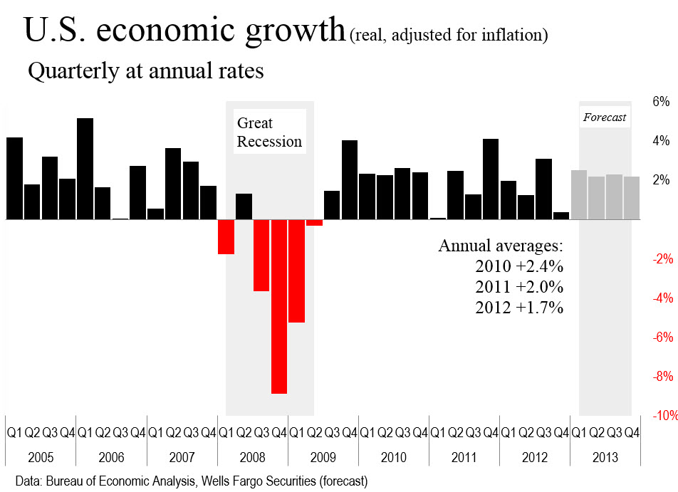
 I learned something new working on these charts. The cycle-dating committee at NBER dates recessions from the peak of cycles that it defines and recoveries from troughs that it also defines. When I shade my charts for the Great Recession, I tend to shade the period from January 2008 through June 2009, covering 18 months.
I keep this shading in the bottom chart. I’m using quarters rather than months. Extending the shading into Q4 of 2007 would imply that the recession began as early as October 2007, and that would be wrong.
Technically, I should shade from December 2007 (recessions begin at the peak) and stop the shading at May 2009 (18 months on). This is the way the charts come out at the excellent charting utilities of the Federal Reserve Bank of St. Louis. I learn something new every day.
One other note, which is yet a third way of emphasizing the weakness of the recovery: The rate of economic growth has been declining in the U.S. See the bottom chart.