 In the decade through Fiscal 2008, Uncle Sam spent at the rate of about 19.4% of U.S. gross domestic product (GDP), and took money in at the rate of about 18.3% of GDP, resulting in annual deficits of about 1.1% of GDP.
In Fiscal 1999, at the start of that 10-year period, the United States took in more than it spent. On GDP of $9.2 trillion, the 1.4% surplus amounted to about $129 billion. In Fiscal 2000, the first year shown on the nearby chart, the budget surplus peaked at 2.4% of GDP, $235 billion.
The U.S. ran a budget surplus for the fourth year in a row in Fiscal 2001, a modest one, 1.3% of GDP of $10.2 trillion, or about $133 billion. That fiscal year ended about three weeks after the 9/11 terrorist attacks.
The first Bush tax cuts (effective before the 9/11 attacks), two post 9/11 wars and the prescription drug benefit for Medicare beneficiaries approved in 2003 pushed the federal income statement back into the red beginning in Fiscal 2002. By today’s standards, the deficits during the period 2002-2008 were relatively modest, averaging only 2.5% of GDP.
Then came the Great Recession (January 2008-June 2009) and its double whammy on the federal ‘fisc’. Receipts, which had peaked at nearly 21% of GDP in Fiscal 2000, collapsed to 15.1% (2008 and 2009). Spending exploded, partly because of stimulus and partly because of automatic shock absorbers like food stamps and unemployment benefits.
As the top chart shows, the one-two punch pushed spending to more than 25% of GDP in Fiscal 2009. Partly because the economic recovery has been tepid (the Great Disappointment), spending has remained high. The books haven’t been closed on Fiscal 2012 ended Sept. 30. But it likely was the third year in a row with spending slightly exceeding 24% of GDP.
Estimates from the Obama administration’s Office of Management and Budget, to the right in the top chart, show spending falling to 22.2% of GDP by Fiscal 2017, when the deficit will have been tamed from 10.1% of GDP (FY 2009) to 3.0%. Skeptics, of course, think these OMB estimates are too optimistic on both sides of the income statement, spending and receipts.
Governor Romney campaigns on the idea of taking federal spending back to 20% of GDP. This is not going to happen. The reason is simple. Demography is destiny. We spend far more on the old than the young (as illustrated by data from the Urban Institute in the second chart).
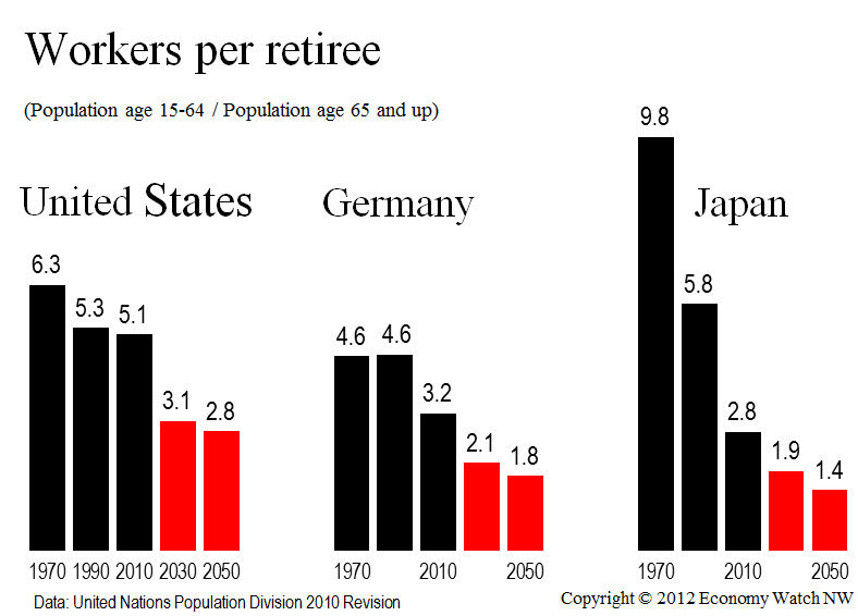
 Every year for as far ahead as the eye can see, there will be fewer people of working age to support each person beyond working age. This is true not only in the United States and other advanced economies, but also in the developing economies, including India and China.
The data are out there for everyone to see. Working with latest data from the United Nations Population Division, I’ve charted the ratio of workers to retirees for three large economies, the United States, Germany and Japan over 80 years starting in 1970 (lower chart).
You can quibble about exact outcomes, which will depend among many other things on actual fertility rates, but you can’t quibble about the trend lines.
Population pyramids are a great way to explore the subject. In preparation for a talk to Seattle University students on the role of government, I explored the idea of using the UN population projections by age group to make my own pyramid charts.
Turns out I didn’t have to. The hard work has already been done by a Belgian programming whiz and computer scientist, Martin De Wulf, who has provided an open-source window into the UN data for virtually every country on the globe here. For most countries, the data set stretches in five-year increments from 1950 to 2100. With a hat tip to Mr. De Wulf, I say enjoy. And start saving more, a lot more. There will be fewer people working to support you in retirement. That’s a forecast you can take to the bank.
On the home page of the UN Population Division, you can find a fascinating wall chart on the aging of the global population. Here are some startling bullet points:
- By 2050, the ranks of 60-and-over will outnumber children (ages up to 14) for the first time in human history.
- Of today’s world population, one person in nine is 60 years old or older; by 2050, the ratio will be one in five.
- The older population is itself aging. Currently, the oldest old population (80 and up) accounts for 14 per cent of the population aged 60
years or over. But it is the fastest-growing segment. By 2050, one in five of the 60-plus set will be 80 or older.
